Tuesday, October 23, 2012
Monday, October 15, 2012
TODAYS QUOTE

There is nothing better than some nice typography and a quote to uplift and inspire the rest of your day. Hope this helps. x
Saturday, October 13, 2012
THE FLINDERS KEEPERS MARKET

Flyer artwork by Matt Roden
The Finders Keepers are BACK in Melbourne
for the Spring/Summer Markets in the world renowned Royal Exhibition
Building, in the Carlton Gardens.This market features MORE
stalls and more room for patrons to explore a fantastic array of new
designers from both Melbourne and around Australia. As well as a fresh
new line up of live music.
This market event we will be running on a Friday evening & Saturday. The markets are FREE entry and parking is available however it is limited.
This market event we will be running on a Friday evening & Saturday. The markets are FREE entry and parking is available however it is limited.
WHERE & WHEN ?
Friday 19th October 6pm - 10pm
Saturday 20th October 10am - 5pm
The Royal Exhibition Building
9 Nicholson Street, Carlton
Friday 19th October 6pm - 10pm
Saturday 20th October 10am - 5pm
The Royal Exhibition Building
9 Nicholson Street, Carlton
TACOS AND TEQUILA


I love this quirky and fun brand for Tacos and Tequila.
The artwork is extremely genius giving a simple taco supper experience a
whole other different feel.
Wednesday, October 3, 2012
SPENDERBUKS


Couldn't resist posting about these gorgeous new prints from Danish artist Nynee Rosenvinge who runs Spenderbuks...and all prints are available via her Etsy shop.


MOSSER TERRARIUM'S
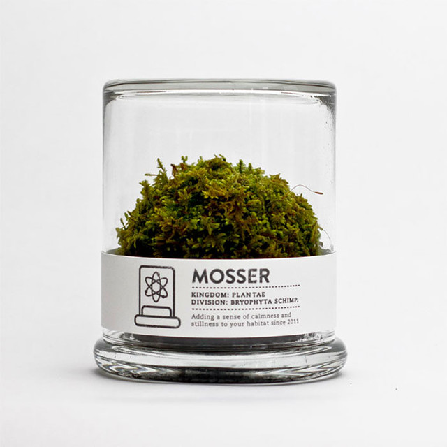
I happen to be obsessed with plants, flowers, home keeping and everything else that my nomadic life cannot really contain... I of course, got a terrarium, you know... .. I found The Mosser yesterday and I'm oh! so smitten with it. The Mosser is a small glass terrarium filled with a simple round moss ball. The Mosser comes with a glass mister bottle used to feed your plant. They are very easy to care for and only need to be sprayed once every two weeks with filtered water. How good does that sound, fellow plant killers? AND makes a perfects gift for anyone.
Tuesday, October 2, 2012
JENNIFER LAWERENCE


Jennifer Lawrence photographed by Tim Walker
for W Magazine, October 2012
Aside from the obvious feathery fancy, the images are, to put it plainly, completely
stunning of Jennifer Lawrence.

Monday, September 24, 2012
DC * STUDIO


I came across the lovely and very cute work of DC Studio. I love the use of colours and the way they have photographed there products, makes me want everything. Their tumblr is worth a visit to find some inspiration and definatily inspired you for some craft
DIY. Visit DC Studio at http://dcstudio.tumblr.com and all their cute cards, plates and pillows are available at http://www.darlingclementine.bigcartel.com
DIY. Visit DC Studio at http://dcstudio.tumblr.com and all their cute cards, plates and pillows are available at http://www.darlingclementine.bigcartel.com
Sunday, September 23, 2012

RICARDO FUMANAL


Ricardo Fumanal
Fumanal’s
artistic training began at the Lleida Secondary School of Arts, where
he specialised in graphic and advertising design. He later moved to
Barcelona, where he worked as a graphic designer while extending his
studies in printing techniques and illustration. After collaborating
with a number of studios and art directors, he focused on producing
illustrations in varying media and formats. These include work for www.elmundo.es or magazines such as Dazed&Confused,
British GQ Style, Vogue Hommes Japan, Madame Figaro, Hercules,
L’Officiel Hommes Italia, Apartamento, Wallpaper*, Nylon Guys, and a great many covers for literary review Leer .Ricardo
Fumanal’s interests range from photography for fashion and advertising
to the Fine Arts which show in his illustration work picture.
BECI ORPIN'S NEW BOOK

I have liked Beci Orpin's design and illustration work for a long time .And I recently heard her speak at Craft Victorica's Craft and Design as Career.Very Inspirational. So when i heard and saw pictures of her new book. I had to do a post. I can’t wait for the book to be out in bookstores from the 1st of November. Which is a bit of a wait...... Keep an eye out here for some sneak peeks and also Melbourne and Sydney launch party details.
Wednesday, September 19, 2012
COLLECTIONS OF OBJECTS

I cant help myself at the moment.I'm a bit obsessed with collections of objects.It could be the cute groupings of all these tiny objects or the fact that they are coloured and grouped ahhh so nice and visually pleasing to the eye !!!
Tuesday, September 18, 2012
NOT TUESDAY
I came across this brand my the name of Not Tuesday while i was in the shop the other day. I love colour combinations so bright and vibrant.Perfect for Spring/Summer .Not Tuesday is designed by Rachel Wightman .Creating harmonious and sometimes unexpected combinations for her necklaces. Each necklace is made from a selection of polymer clay beads which are all handmade and colour mixed by Rachel, making each one unique.
Monday, September 17, 2012
STYLISH SIMPLICITY


Factory with a twist.Spread with soft shades of pink and grey. Line Klein - the Copenhagen based photographer shares in her blog lovely pictures in the soft shades of pink and grey. And as usual they take my breath away with their stylish simplicity.
Sunday, September 16, 2012

FAT MAGAZINE


FAT Magazine is a new international magazine from Denmark, published by the
Copenhagen-based design agency Dyhr.Hagen. We had the pleasure of designing pages for FAT MAGAZINE Issue 2, based on the keyword "Re-Invention." Typography is designed with flowers.
Wednesday, September 12, 2012
KIP & CO


Kip & Co began as the little dream of Melbourne girls, Alex, Kate and Hayley to create bright and beautiful. It’s their first range and to celebrate they’ve called it Confetti Storm SS12. Bringing new colour and energy to our bedrooms for summer. It’s a colourful range, with explosions of bright neons and sharp patterns that can be mixed and matched. Kip & Co designs have been inspired by unique, wild, and brave art and nature, soaked up on backpacking adventures around the globe and flea markets down the road .I love how they have mixed the bright modern prints with the velvet quilt covers – clever! A new quilt cover and a couple of cushions can change the look of a bedroom entirely.
Tuesday, September 11, 2012

BEC WINNEL MULIEBRITY
.jpg)
.jpg)
Muliebrity
Bec is a self taught artist. Her art practice has changed from a young
girl who drew realistic horses over and over, to exploring digital art
whilst studying graphic design, then back to traditional techniques and
mediums for her current personal work and incorporating digital
techniques for commercial illustration. 2012 is her first year as a full time artist and is showing her first solo show.
The
exhibition is being held at Just Another Agency Project Space as a
sideshow to the Semi-Permanent conference Melbourne. So anyone who is going to be in Melbourne this Friday night or going to
the Semi-Permanent conference, go along.For more details on the show @ Just Another Agency HERE.

Monday, September 10, 2012
MAKE TODAY HAPPY


Kikki K New Collection,14 Day's of Happiness. Just a little something to make you happy as well as other people around you. What a good idea and how could you
resist with such bright colours and cute designs.
resist with such bright colours and cute designs.
BENEATH THE SUN NEW RANGE

Exclusive sneak peek of the new range from Beneath the Sun. How Pretty are these colours? Can't wait to see all of their new pieces. Love the use of colour.
NICE TYPE


Design By : Anthony Neil Dart Johannesburg, South Africa
Nutura is an experimental typeface based on a geometric deconstruction
of Futura. The posters are for an upcoming exhibition called Paperwork.His typography work is amazing.
Wednesday, September 5, 2012


FIRST WEEKEND OF SPRING


"Spring i haven't seen you in a while, maybe a bit too long". I forgot
how good you are. It was pleasure to be reacquainted again and to sit
and bask in your presence."Three days so
far ,so good. With sun and the blooms in all their glory. I couldn't
ask for anything more pleasant. To feel the warm rays on my
very white skin. What a beautiful way to start spring and September.
I hope you all enjoyed your weekends, too.x
Subscribe to:
Posts (Atom)